UI DESIGN
Mobile UI Kit
UI DESIGN
Mobile UI Kit
UI DESIGN
Mobile UI Kit
The project
iOS & Android
iOS & Desktop
The project consisted of creating a UI Kit for QRNow, a mobile app that creates and scans QR and barcodes.
The style was defined by the logo, so I extrapolated this to all the components and aimed to create a clear, tidy, and serious app. I created at least 100 components for over 20 mobile screens.
The design team was composed of the lead designer, one UX designer, and two UI designers, one of whom was myself.
Project details:
Project details:
Project details:
Client
QR Now
Role
UI Designer
Date
2022
Tools
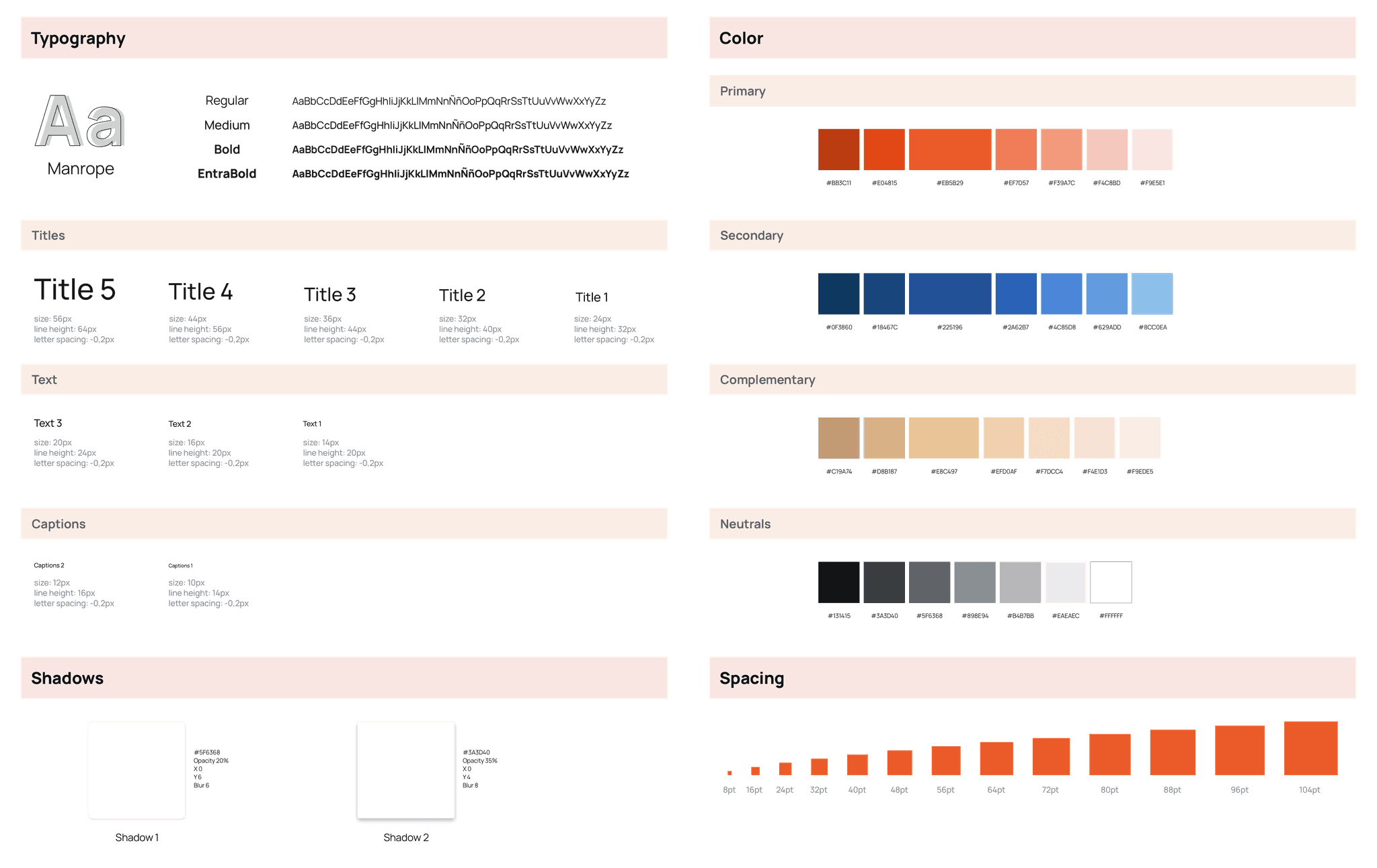
Foundations
Icons
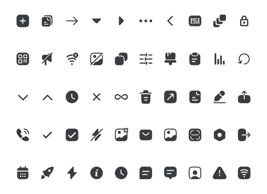
I chose a family of rounded and filled icons. This decision was made because we wanted icons to give a softer and more approachable appearance, as well as icons to stand out more clearly within the user interface. This will provide visual interest and variety.
Icons
I chose a family of rounded and filled icons. This decision was made because we wanted icons to give a softer and more approachable appearance, as well as icons to stand out more clearly within the user interface. This will provide visual interest and variety.
Icons
I chose a family of rounded and filled icons. This decision was made because we wanted icons to give a softer and more approachable appearance, as well as icons to stand out more clearly within the user interface. This will provide visual interest and variety.
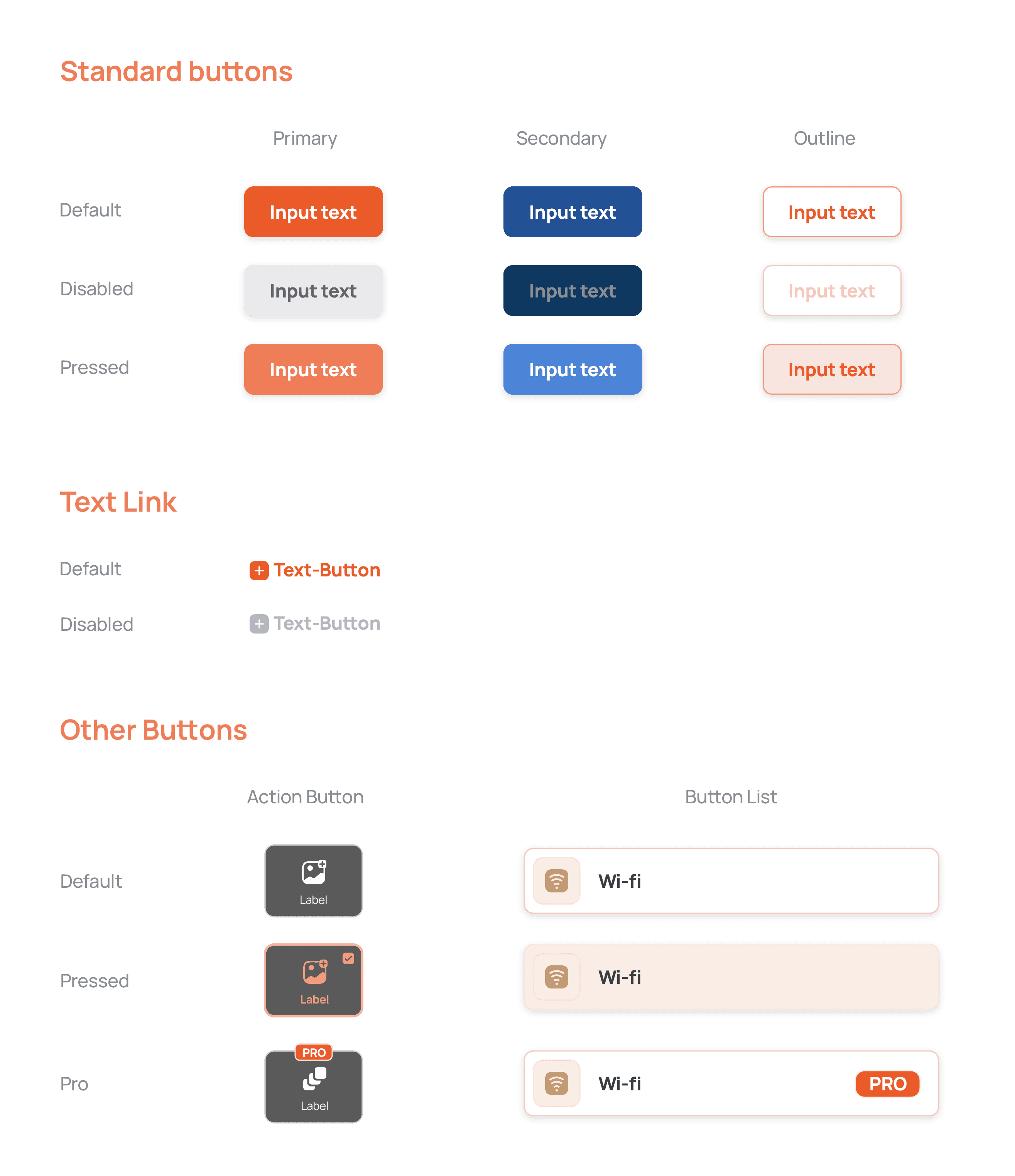
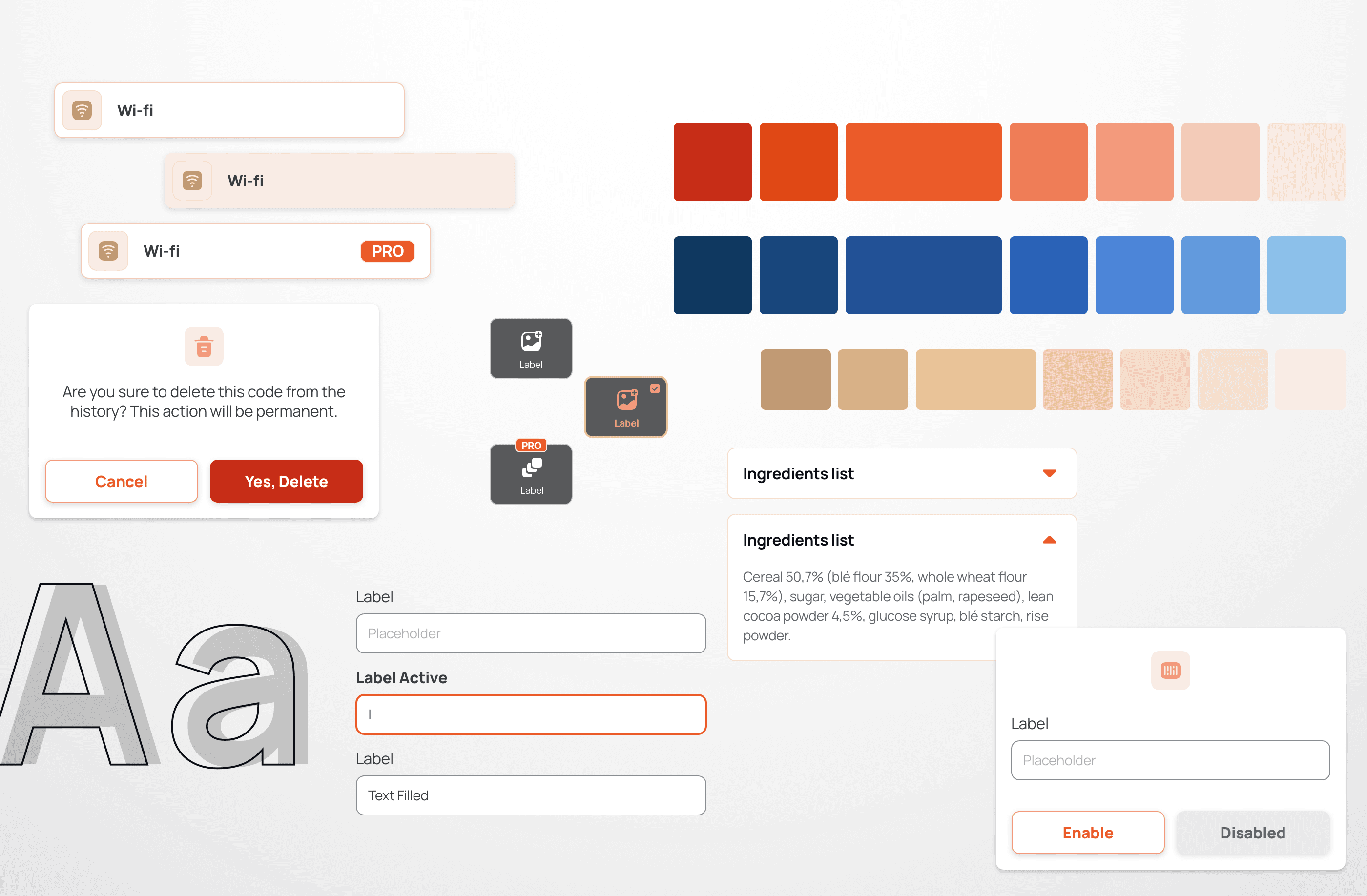
Buttons
I defined 3 types of buttons: Primary, secondary and complementary. Each of them with the states default, disabled and pressed.
Text links were needed as well. For this particular component, I defined not only the type color and weight, but also to be next to an icon.
Also I defined Actions buttons and Button Lists with the default and pressed states, plus the Pro version.
Text fields
The other big category of components I built for are text fields. Not only they have to accommodate different states, but for this project, there was the specific need of different types of form fields.
Text fields
The other big category of components I built for are text fields. Not only they have to accommodate different states, but for this project, there was the specific need of different types of form fields.
Text fields
The other big category of components I built for are text fields. Not only they have to accommodate different states, but for this project, there was the specific need of different types of form fields.
Some other components
Site built in Framer
Site built in Framer
Agustina Del Moro © 2023
Agustina Del Moro © 2023