DESIGN SYSTEMS
DESIGN SYSTEMS
Ontop Design System
About
Ontop is a global payroll platform with built-in financial services for remote workers. Enabling companies to onboard and pay global talent while helping remote workers to receive their payments in US dollars.
I am the designer in charge of maintaining the design system, creating, iterating, and documenting all the components. I worked with the Atomic Design methodology.
I collaborated with Anthony Juarez Solis, who was responsible for developing and maintaining the components for the company's development team.
Project details:
Client
Ontop
Role
Sr. Design System Designer
Date
2023-2024
Tools

Project details:
Client
Ontop
Role
Sr. Design System Designer
Date
2023-2024
Tools
Project details:
Client
Ontop
Role
Sr. Design System Designer
Date
2023-2024
Tools
UX/UI Methodologies & Techniques
UX Research for specific component
UI Design
QA of implementation
Style Guide
UI Inventory
UX Audit
Test of components
The Challenge
When I joined the company, the Design System was already in place. I encountered more than two libraries in use, outdated components, and errors in components.
This meant that designers were using components not belonging to the library, and developers ended up creating them repeatedly.
We needed to:
Conduct an audit and review of the components.
Recreate old components with variants.
Document all of the components.
The Solution
Reorganize the library and clean up deprecated or outdated components.
Guide the design team in understanding the Design System and its usage.
Hold biweekly meetings with each designer to review workflows and component usage.
Create a structured process for requesting new components.
Clearly and concisely communicate any changes to the library.
Design Principles & Foundations
We started by defining the company's Design Principles: Simple, Magical, Empathetic, Trustworthy, Global.
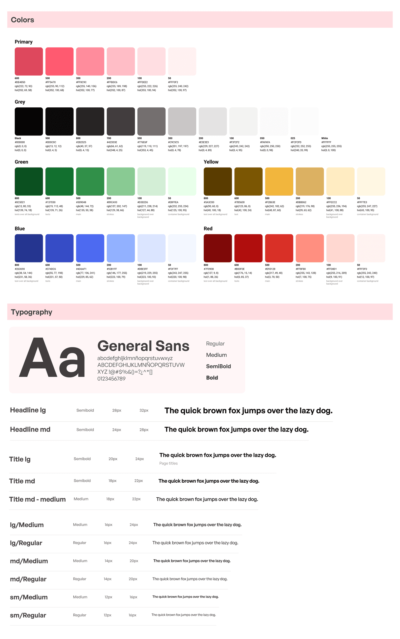
Then we continued with the foundations, which were already partially done. What we did, was implement new changes in colors and typography to the existing style guide.
The foundations consisted of:
Color & Typography
Border radius
Spacing
Grids: Two different grid types for B2B and B2C.
Shadows
Icon pack
Illustration set
Animations
Design Principles & Foundations
We started by defining the company's Design Principles: Simple, Magical, Empathetic, Trustworthy, Global.
Then we continued with the foundations, which were already partially done. What we did, was implement new changes in colors and typography to the existing style guide.
The foundations consisted of:
Color & Typography
Border radius
Spacing
Grids: Two different grid types for B2B and B2C.
Shadows
Icon pack
Illustration set
Animations
Illustrations
We created a set of 80 illustrations with a modern and simple style, but not flat or dull. We used gradients in certain details to give them a unique style and to standardize them.
Illustrations
We created a set of 80 illustrations with a modern and simple style, but not flat or dull. We used gradients in certain details to give them a unique style and to standardize them.
Illustrations
We created a set of 80 illustrations with a modern and simple style, but not flat or dull. We used gradients in certain details to give them a unique style and to standardize them.

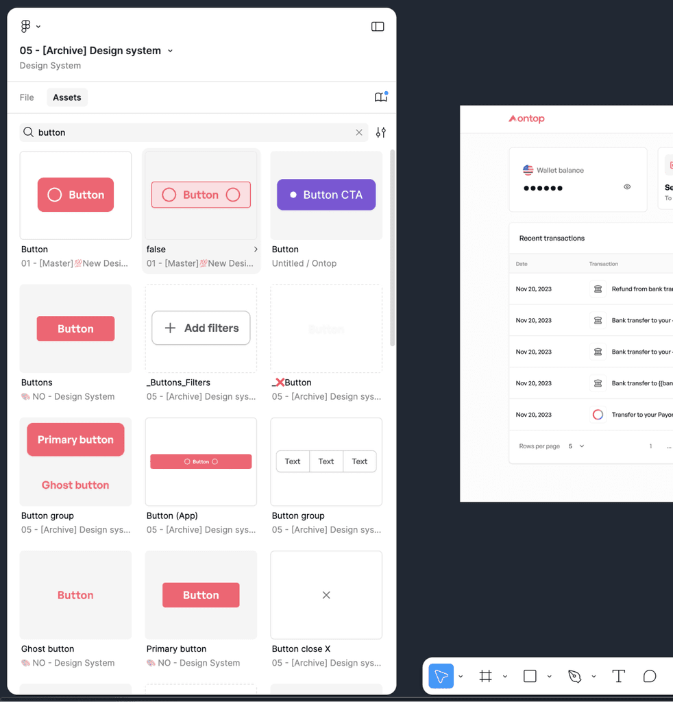
Component library
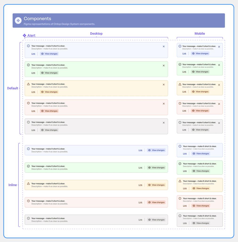
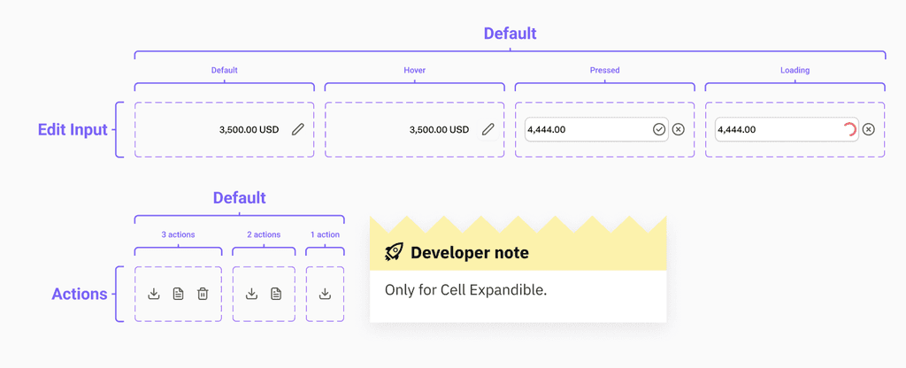
The library contains more than 150 components, each of which was reviewed and, when needed, redesigned.
The biggest challenge of this Design System was to carefully unify and refine everything. To achieve this, I defined:
Component library
The library contains more than 150 components, each of which was reviewed and, when needed, redesigned.
The biggest challenge of this Design System was to carefully unify and refine everything. To achieve this, I defined:
Component library
The library contains more than 150 components, each of which was reviewed and, when needed, redesigned.
The biggest challenge of this Design System was to carefully unify and refine everything. To achieve this, I defined:
Component name:
To avoid miscommunication between designers and developers, the naming needed to be clear so that the components would function as intended without errors.
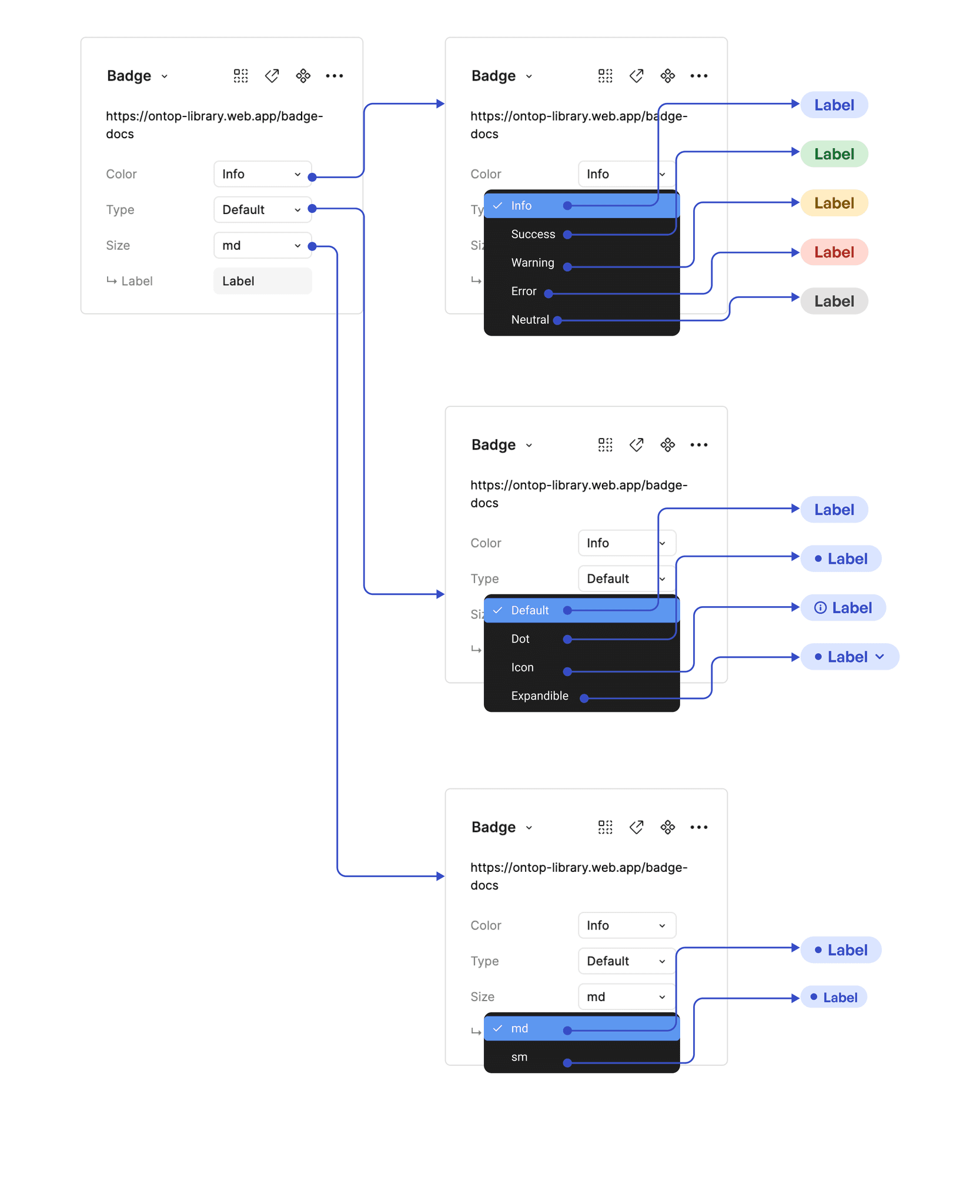
Variables, states, types:
I created and modified variables for better and easier use by designers. These definitions also impacted the development team, so we maintained constant communication to agree on the best way to standardize.
Component name:
To avoid miscommunication between designers and developers, the naming needed to be clear so that the components would function as intended without errors.
Variables, states, types:
I created and modified variables for better and easier use by designers. These definitions also impacted the development team, so we maintained constant communication to agree on the best way to standardize.
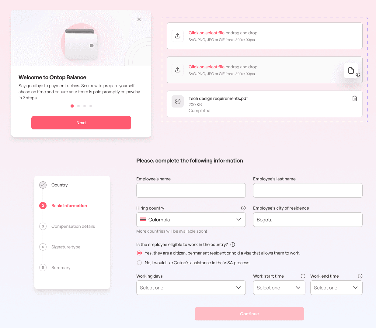
Notes and instructions:
Page annotations and descriptions were added to clarify. In some cases, I created a tutorial explaining how to use these more complex components, such as tables or modals.
Breakpoints:
Any size indications and breakpoints for the developers. We worked on all components for Desktop and App, and in some exceptions, for Tablet as well.
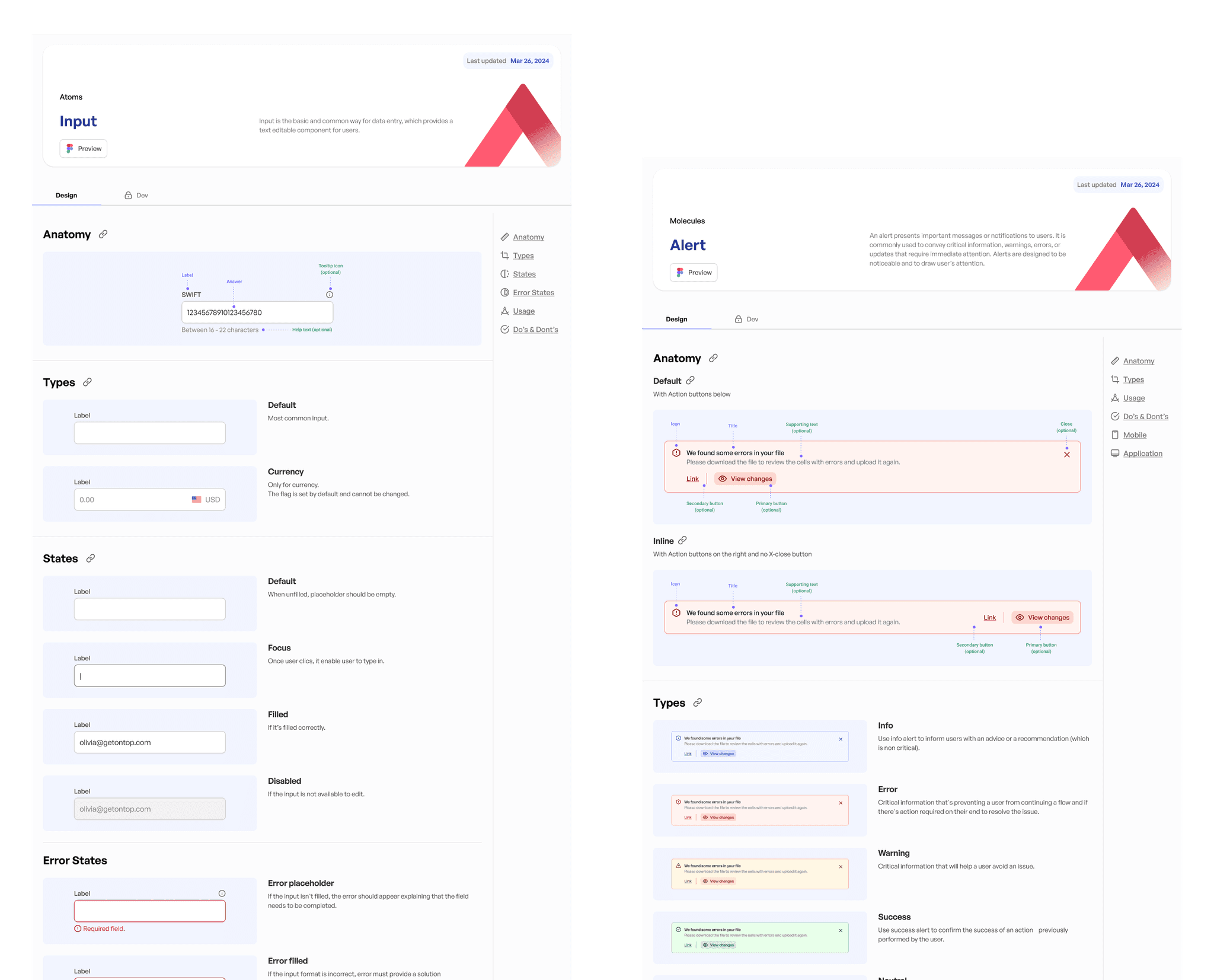
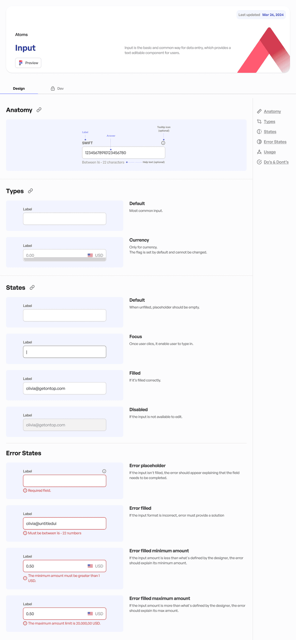
Documentation
We are in the process of documenting all components. To ensure clarity and consistency, we created a comprehensive template that includes the following sections:
Anatomy
Types
Variants: Might include different sizes, color schemes, or interactions.
States: Typically include default, hover, active, disabled, and focused, among others.
Error States: How components should behave and appear in error conditions.
Usage: Includes best practices and guidelines.
Do's & Don'ts: Clear and visual examples of how to use the component correctly and how to avoid common mistakes.
Content: Tone, style, and length, ensuring that the content aligns with the brand voice.
Mobile: How each component should behave and appear on mobile devices.
Accessibility: How to make the component usable for people with disabilities, including considerations for screen readers, keyboard navigation, and color contrast.
Application: Examples of the component in use.
Site built in Framer
Site built in Framer
Agustina Del Moro © 2023
Agustina Del Moro © 2023