DESIGN SYSTEMS

Dark mode design system

DESIGN SYSTEMS

Dark mode design system

DESIGN SYSTEMS

Dark mode design system

About

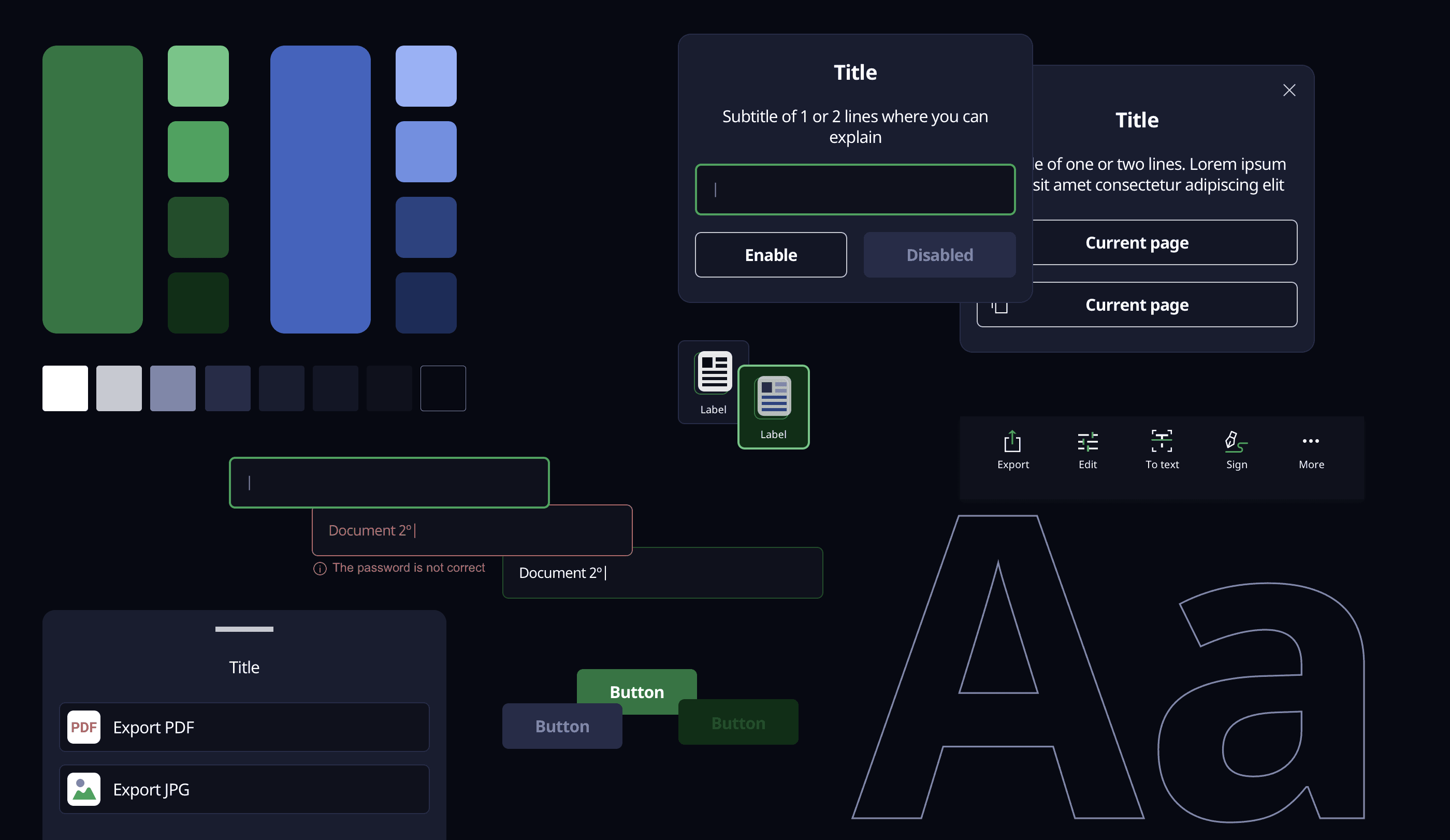
A design system is a comprehensive set of standards designed to manage large-scale design projects by utilizing reusable components and patterns. In this particular instance, we have developed a design system for ScanShot, a mobile app dedicated to scanning documents and images. The app provides functionalities such as editing, text conversion, and much more.

Project details:

Client

ScanShot

Role

Product designer

Date

2021-2022

Tools

Project details:

Client

ScanShot

Role

Product designer

Date

2021-2022

Tools

Project details:

Client

ScanShot

Role

Product designer

Date

2021-2022

Tools

Color

Color in a dark mode app is vital for establishing hierarchy, readability, user experience, accessibility, consistency, and branding. By carefully considering color choices, I have created visually appealing and functional dark mode experiences for our users. I choose green as primary color with its luminance variations, and light blue as secondary color, with its variations as well.

Typography

By selecting an appropriate typography that prioritizes readability, creates visual contrast, establishes hierarchy, aligns with branding, accommodates localization needs, and considers performance, we can enhance the user experience and ensure that the text is effectively communicated in a dark mode app.


We went with Noto Sans, because it has a clean and modern design with a balanced proportion between its letterforms. It offers excellent legibility and readability.

Other foundations

Grid System: A 8pt grid system, that consisted of a 8 column grid with margins and gutter of 16pt.


Shadows: I defined 2 different shadows for cards, buttons and other main components.


Border Radius: 2 variations were defined: 4pt and total roundness for main buttons.


Icons: We decided to go with sharp icons and to create for main icons two-color icons. The use of two colors in icons allows for greater visual depth, contrast, and detail.

Components

Components are reusable and modular elements that are used to construct the UI of a product.


They are reusable, consisten, scalable, and modular. Common examples of components in this design system include buttons, navigation menus, cards, modals, textfields, searchbar, lists, etc.


Each component has its own defined set of attributes, styles, and interactions.

More components

Site built in Framer

Site built in Framer

Agustina Del Moro © 2023

Agustina Del Moro © 2023